Make it easy,
but significant.
Web design
I’m Davide La Canfora and I’m a webmaster with a degree in Communication. Since I was young I have cultivated a passion for graphics and visual art, acquiring the necessary skills to develop websites, brand identities and coordinated images for companies and professionals, enhancing their online presence. To promote any business, you need to create a site that is captivating and functional. It is essential that the site is easy to use, so that you can manage it easily and always keep the content up to date. Also, the user experience must be engaging and intuitive!
Design
Personalized and distinctive websites, tailor-made for your brand. Without using pre-packaged themes, but with unique and original graphics that adapt perfectly to your communication needs.
usability
User-friendly, intuitive and easy to navigate websites, designed to guarantee an optimal user experience on any device, with particular attention to mobile-first design.
speed
Quick and easy site management. You will be able to update the contents independently and without difficulty. WordPress is the easiest to use, reliable, complete and secure CMS platform on the market.
Portfolio
Welcome to the Portfolio section! In this section you will find some examples of websites I have created over the years, including landing pages, showcase sites and e-commerce. These projects represent only a small fraction of the vast array of websites I’ve built over the years. Every website I create is unique and personalized, designed to meet the specific needs of my customers. My passion for design always pushes me to take care of every minimal graphic detail, but my main goal is to create a functional and successful website for my clients.
Davide Pastocchi
_SARTORIA_
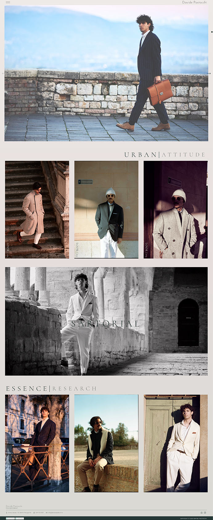
Website created for Davide Pastocchi, a talented artisan who has recently opened his bespoke tailoring shop in the village of Perugia. Davide’s tailor shop specializes in men’s suits, crafted according to ancient tailoring traditions and using only high-quality fabrics.
The website was designed to reflect Davide’s craftsmanship and the art of tailoring. Special attention was given to the visual aspect of the site, with various photo galleries showcasing examples of Davide’s creations, giving visitors an immediate view of the quality and unique style of his suits.
The result is a website that not only celebrates the art of classic tailoring but also offers a functional and appealing platform to attract new customers and fashion enthusiasts.

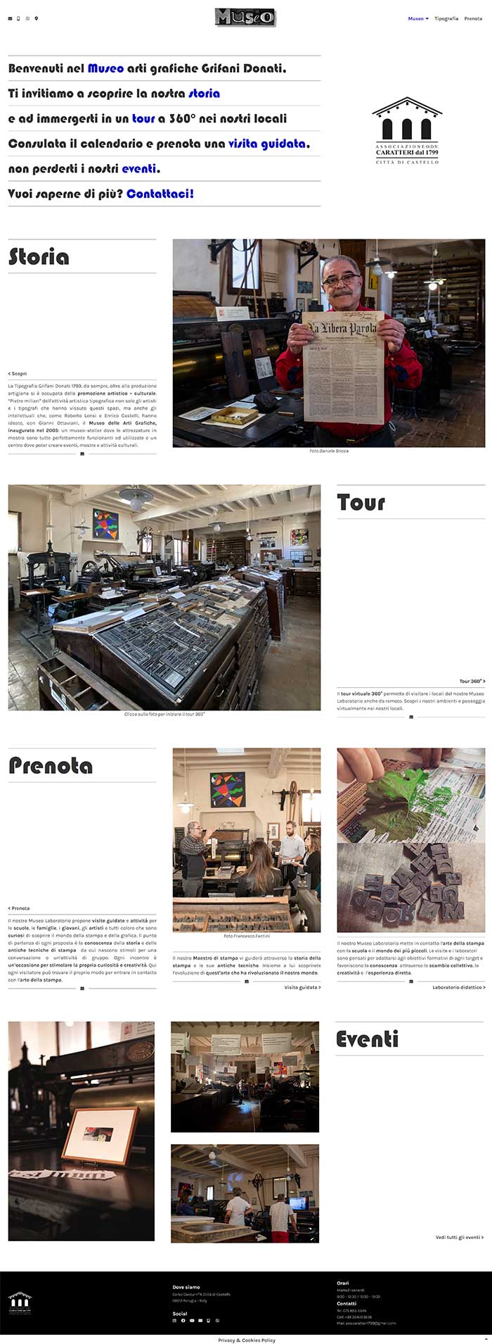
Creating the website for the historic Grifani Donati Typography, founded in 1799, was a fascinating project. The website has been divided into two parts, one dedicated to the typography and the other to the museum. The site was built with a modern, elegant and refined design, in line with the company’s unique atmosphere and century-old experience. Furthermore, particular attention has been paid to the usability of the site, guaranteeing simple and intuitive navigation for users. The end result was a captivating and functional website, capable of making the most of the Grifani Donati typography and its centenary history.

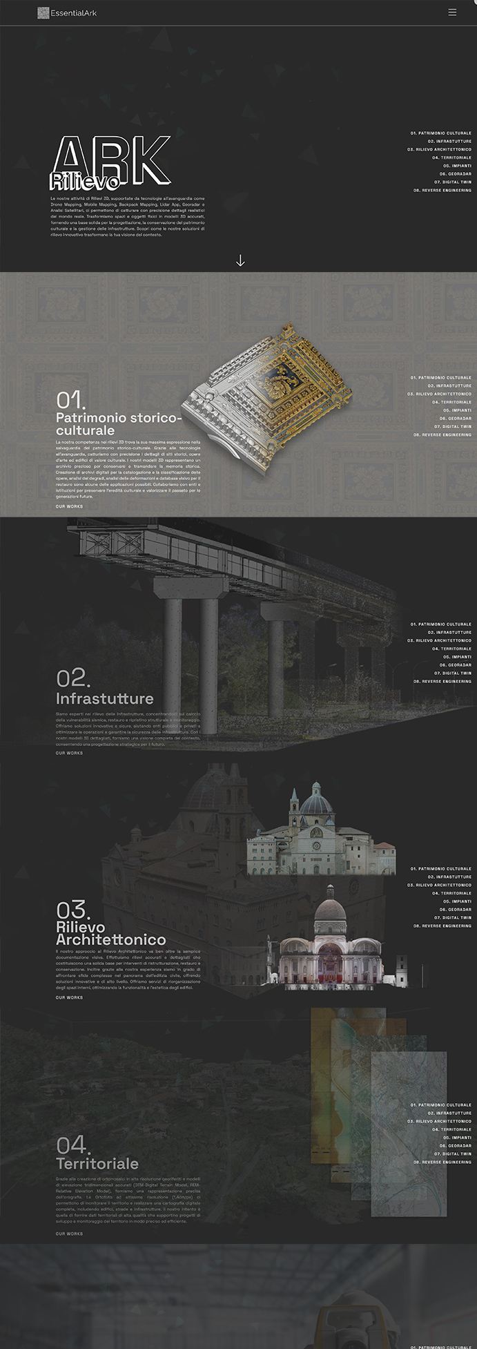
The creation of the website for the architecture studio based in Foligno, Umbria, was an exciting and engaging project. We divided the site into three key sections, each dedicated to the studio’s core services: digital, surveying, and construction. The website’s design is a blend of modernity, elegance, and sophistication, aligning perfectly with the studio’s history and uniqueness.
We placed particular emphasis on user experience, ensuring an intuitive and seamless navigation. The result was a captivating and highly functional website that masterfully reflects the studio’s identity. The site captures the passion and expertise of the architecture studio, providing an engaging platform to explore its services and past projects.
I was happy to collaborate in the creation of the website for the Home Staging Project, which aims to transform living spaces into welcoming and functional environments. We have paid close attention to the graphic and design part, defining a modern and elegant layout and using colors and images effectively to convey the brand’s professionalism and attention to detail.
We have included a blog on the site, where advice, insights and trends on the world of home staging are shared. In addition, the site presents a fantastic portfolio, with photo galleries of completed projects, to best show the results obtained and let visitors experience a house transformed thanks to home staging.
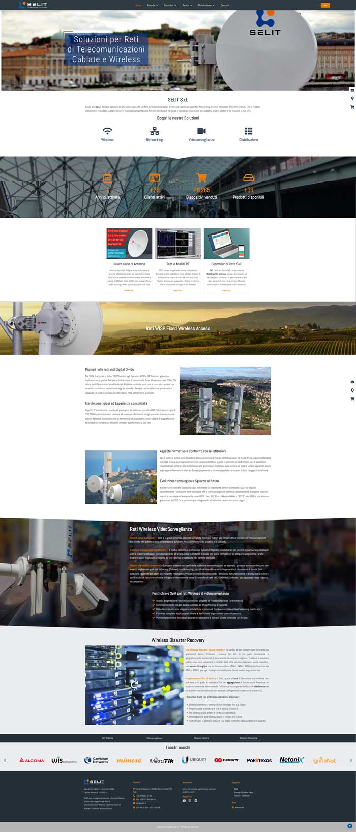
The experience of creating the website for Selit, a reference point in the field of wireless and wired telecommunications networks, has been stimulating and engaging. We structured the site into three key sections, each focused on the main services offered: thermal insulation, sound insulation, and customized solutions. The site’s design is a fusion of modernity, sophistication, and elegance, perfectly aligned with Selit’s unique identity in the industry.
We paid particular attention to the user experience, ensuring smooth and intuitive navigation. The result was a captivating and highly functional website, capable of masterfully reflecting the wide range of solutions offered and Selit’s extensive experience in the telecommunications field. The site provides an engaging platform to explore our services and past projects, effectively conveying our passion and commitment to providing cutting-edge connectivity solutions to our clients.
About
Welcome to the About section!
In addition to an academic path that allowed me to acquire the theoretical skills that still accompany me today in my work, over the years I have collaborated with various companies and agencies, acquiring experience in the design and development of responsive websites, optimized for search and seamlessly integrated with social media. I have also worked on e-commerce projects, content management and web application integration.
Furthermore, I offer branding and coordinated image design services, helping my clients to create a coherent and distinctive digital presence.
I am always on the lookout for new challenges and inspiring projects, and I enjoy working closely with my clients to ensure a high quality, satisfying end result. If you are looking for a reliable partner for the creation of your website and the definition of your brand identity, do not hesitate to contact me.
